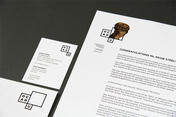
I always liked Google’s playful treatment of its corporate logo with many different “doodles” over the years. The idea of logo variations was added on after the original logo was created. Toronto’s OCAD University unveiled a new logo last week that has this type of creativity built in from the get-go. I am not a designer but I love the concept.
“[T]he new logo is a triumvirate of Mondrian-esque frames, with ‘OCAD’ in one frame and ‘U’ in another. The third, largest frame, is left open for whatever the university wants to throw inside. It could, for instance say ‘OCAD University.’ It could also say ‘Imagination Is Everything,’ the school’s battle cry. But its primary purpose is to show off students’ creative toils. Each year, graduating student medal winners will be invited to mine their portfolios and contribute a piece to the logo, whether a sculpture, a graphic work or a painting, providing a set of logos for the following year.”
– Suzanne Labarre, Senior Editor at Fast Company Co.Design in Bruce Mau’s Smart Art-School Logo Is A Mini Art Gallery For Student Work
More perspectives and images can be found at blogTO, Fast Company Co.Design and OCAD University’s visual identity pages.
[Image Source: blogTO – Video Source: Fast Company Co.Design]
